
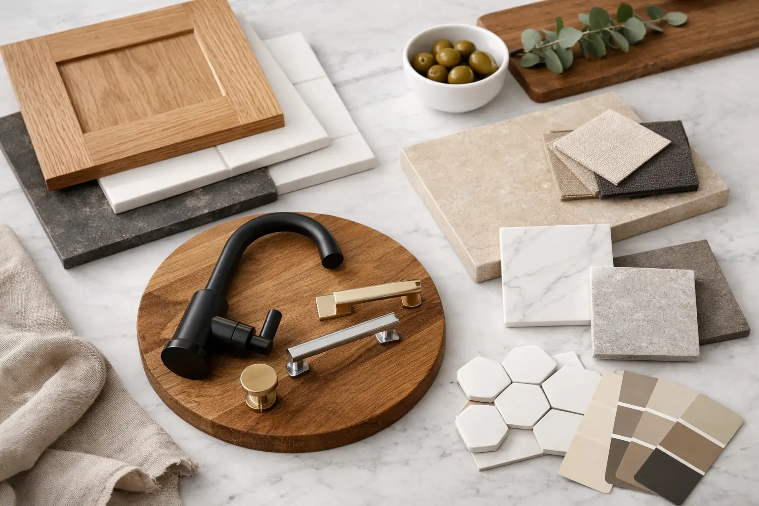
A kitchen can have beautiful cabinetry and still feel wrong once the countertop reflects too much light, the backsplash grout starts collecting grease, or the hardware feels small in your hand. That is why a guide to selecting kitchen finishes should start with real use, not with a saved photo. We ask clients how they cook, who uses the kitchen, how much daylight comes in, and what they are willing to maintain before discussing a final color.
Finishes are the surfaces you touch and see every day: cabinet fronts, counters, backsplash, flooring, handles, faucets, and appliances. They need to work together, but they do not need to match. A kitchen with every surface in the same tone often looks flat. The better result comes from controlled contrast, good proportions, and materials chosen for the way the home actually operates.
Start With the Fixed Conditions
Before choosing a cabinet door color or a stone slab, look at what cannot easily change. In a Brooklyn apartment, that may be limited natural light, an existing floor you plan to keep, a tight galley layout, or exposed brick. In a larger home, it may be an open-plan room where the kitchen needs to relate to the living and dining areas.
Bring measurements, photos, and, if possible, a basic plan to the first conversation. Ceiling height, window placement, room orientation, and the size of the island all affect which finishes make sense. A dark walnut kitchen can look rich and architectural with ample light and a large footprint. Put the same finish in a narrow, shaded kitchen with dark flooring, and the room can feel smaller than it is.
This is also the stage to be honest about budget. Natural stone, custom lacquer cabinetry, integrated appliances, and hand-finished metal details can all be worth the investment. But it is better to spend properly on the surfaces that take the most abuse than to spread the budget thinly across every category. Cabinet construction, countertop material, hardware, and installation should not be compromised for a decorative backsplash that will be replaced in five years.
A Guide to Selecting Kitchen Finishes by Use
The most useful question is simple: what happens here every day? A couple that orders in most nights can prioritize visual impact and entertaining. A family cooking three meals a day needs surfaces that tolerate heat, spills, fingerprints, and repeated cleaning.
Cabinet finishes: appearance versus maintenance
Matte cabinet fronts have a calm, tailored look and work well in contemporary kitchens. They are usually more forgiving than high gloss, especially in deeper colors, but not all matte finishes perform the same way. Ask to handle the actual sample. Some soft-touch finishes mark easily from oils; others have advanced coatings that clean well with a damp cloth.
High-gloss lacquer reflects light and can make a compact kitchen feel more open. It also shows fingerprints, smudges, and scratches more readily. For clients who want that polished look, we often use gloss selectively - perhaps on an island or a run of upper cabinets - and balance it with matte or textured doors elsewhere.
Wood veneer brings warmth that painted cabinetry cannot fully duplicate. The grain should be planned, not treated as an afterthought. On tall pantry doors, continuous or book-matched veneer can make a major difference. Wood needs thoughtful placement around water and heat, but a quality veneer from a strong Italian supplier is a serious, durable finish when specified and installed correctly.
Countertops: choose the slab for your habits
Marble is beautiful because it changes with use. It etches, it can stain, and it develops a patina. Some clients love that honest aging. Others see every mark as a problem. Neither reaction is wrong, but it should be clear before the slab is ordered.
Quartzite offers the movement and depth many people want from natural stone, often with better resistance to daily wear. Still, not every quartzite performs the same way, and sealing requirements vary. A stone should be selected by its actual characteristics, not only by the name on a sample tag.
Porcelain and sintered stone are strong options for busy kitchens. They resist heat and staining well, and they can be fabricated in large formats with a clean, modern look. The trade-off is aesthetic: some clients prefer the depth of a natural slab, particularly when the stone continues up the wall or wraps an island.
Engineered quartz remains practical for many homes, especially where easy maintenance is the priority. Avoid choosing it simply because it is familiar. Look at the full slab, not a small chip. Repeating patterns can become obvious on a large island.
Backsplash: let one surface lead
The backsplash is where kitchens become overdesigned. If the countertop has strong veining, a quiet backsplash usually gives the room room to breathe. Carrying the same stone from counter to wall can look precise and substantial, especially behind a range. It also reduces grout lines, which matters for cleanup.
If the counter is restrained, tile can bring character. Handmade tile has variation, and that variation is the point. It is not the right choice for someone expecting every piece to be identical. Consider the grout color carefully as well. White grout around a cooktop is rarely the low-maintenance option people imagine.
Build a Finish Palette, Not a Collection of Samples
A good kitchen generally has one dominant finish, one supporting finish, and one or two accents. For example, warm oak cabinetry may be the dominant material; a pale, softly veined stone supports it; aged bronze hardware provides the accent. That is enough.
The samples must be viewed together in the actual lighting conditions. A warm white cabinet can look clean in a showroom and yellow next to a cool white wall at home. A gray countertop may read blue near a warm oak veneer. Take samples to the window, place them horizontally and vertically, and look at them in morning, afternoon, and evening light when possible.
Undertones are what cause most expensive mistakes. White is not just white. It can lean cream, pink, green, gray, or blue. The same is true of black, beige, and wood tones. When a client says they want a neutral kitchen, we narrow down which neutral they mean before selecting anything.
Metal finishes deserve the same attention. Brushed nickel, chrome, black, brass, and bronze can coexist, but they need a reason. Match every metal exactly and the room can feel overly coordinated. Mix them randomly and it looks unfinished. Usually, one finish should lead on the faucet and primary hardware, while a secondary finish appears in lighting or furniture details.
Do Not Treat Hardware and Edges as Small Decisions
Hardware changes the way cabinetry feels in your hand and at a distance. A thin edge pull can make a slab-front kitchen look disciplined and modern. A substantial handle gives tall doors more presence and can be easier for children or older family members to use. Test the pull with the actual door finish. What looks elegant on a sample board may disappear against a dark veneer or look too sharp beside a rounded profile.
Countertop edges also affect the final impression. A simple eased edge is clean and practical. A thicker mitered edge gives a stone island more visual weight. Waterfall ends can be dramatic, but they are not automatically the right answer. In a compact kitchen, they may use valuable overhang space or draw attention away from better details.
Plan the Whole Kitchen Before Ordering
A finish decision cannot be separated from fabrication and installation. Confirm where seams will fall, how the countertop meets the backsplash, whether cabinet panels align with appliance doors, and how filler panels will be finished. These details are where an expensive kitchen either looks intentional or starts to feel pieced together.
Lead times matter too. Custom cabinetry, specialty stone, imported tile, and made-to-order hardware do not all arrive on the same schedule. If one material is nonnegotiable, it should be selected early enough that the rest of the project can be planned around it. A substitute chosen under pressure rarely has the same effect.
When clients visit D&D Design Center, we prefer to put the cabinet, stone, hardware, and flooring samples on one table and discuss the project directly. New arrivals are worth seeing in person because texture, scale, and finish quality do not come through properly on a screen. A serious material choice deserves more than a thumbnail.
The right kitchen finishes are not the ones that look best for one afternoon. They are the ones you still respect after hundreds of dinners, rushed mornings, guests at the island, and ordinary cleanup. Bring the plans and the samples together, look closely, and choose materials that can live as well as they look.